


Localé Consulting
Brand identity for a niche consultancy working with communities in regional New South Wales. With a focus on the local government sector, Localé Consulting's end game is contributing to more vibrant and prosperous places for everyone to enjoy.
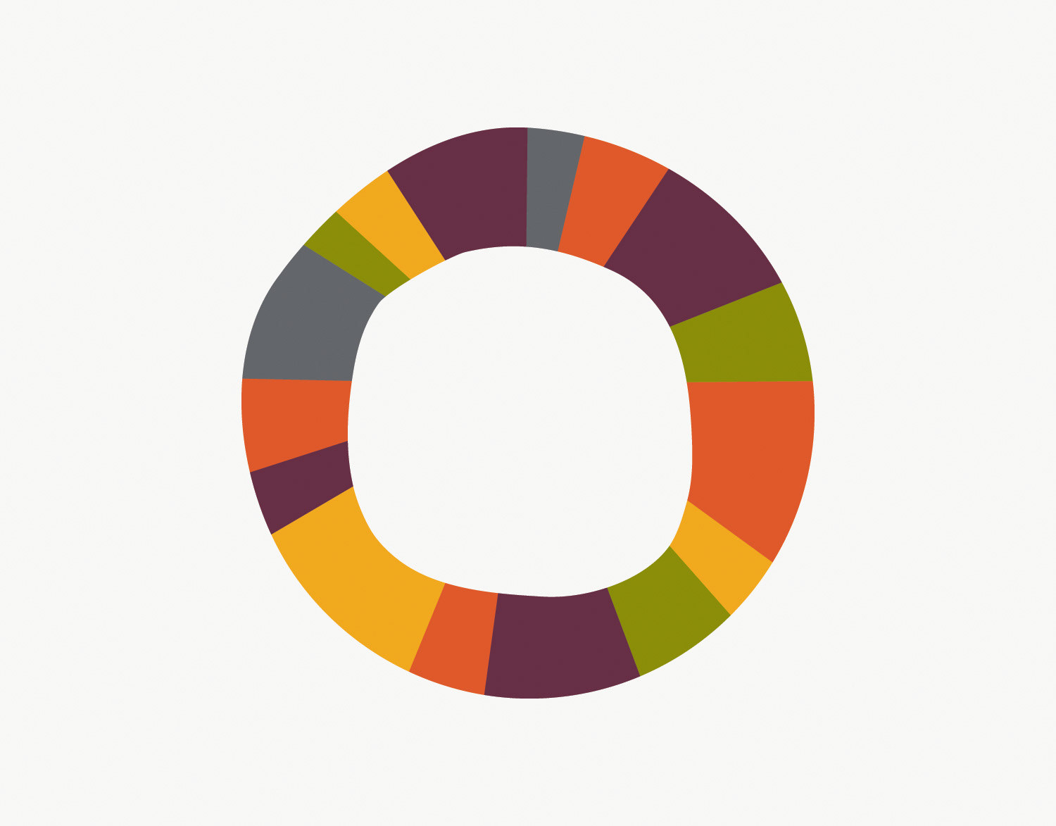
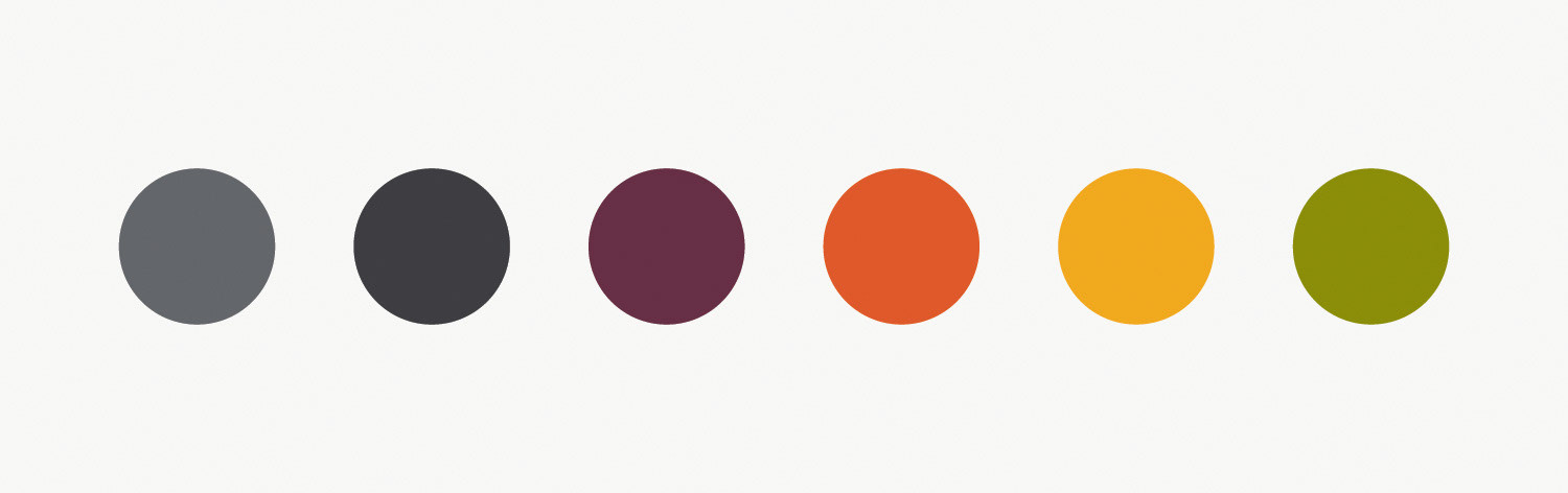
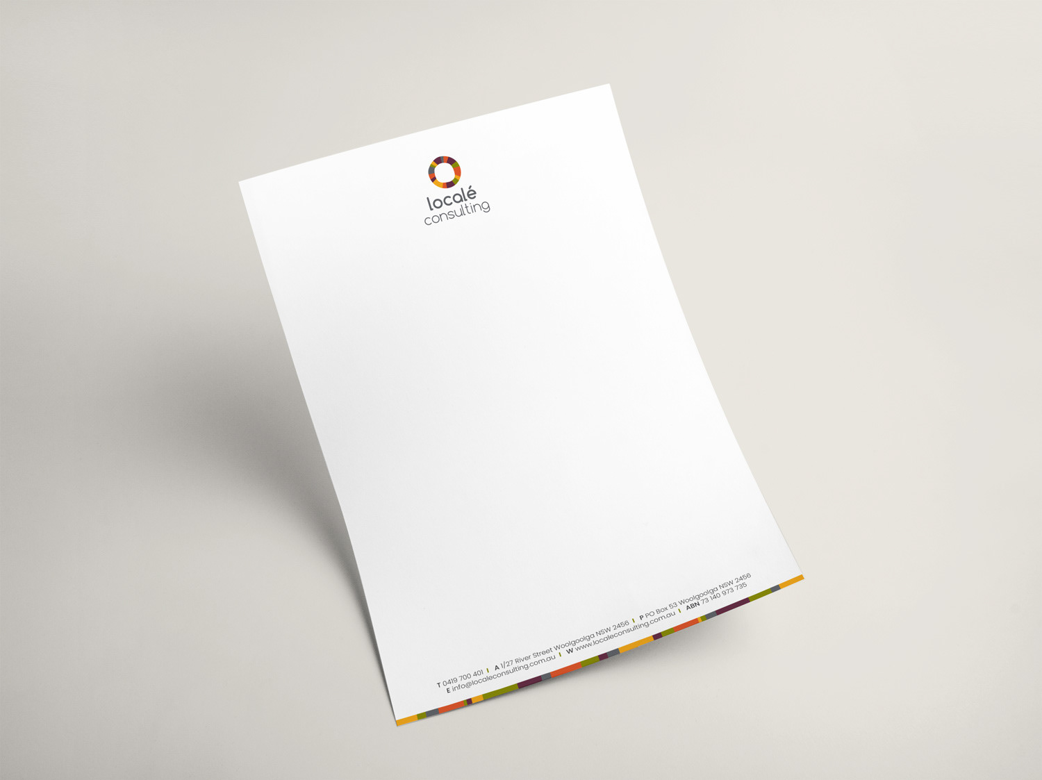
This ongoing project began with a logo redesign. The four principal colours were selected to represent each facet of the consultancy's operations: plan, advise, engage and govern. Over time, the company has altered the focus of its services; however, the blocks of yellow-based colour still work to signify a number of key words associated with the consultancy and its team: vibrant, creative, dynamic and down to earth.
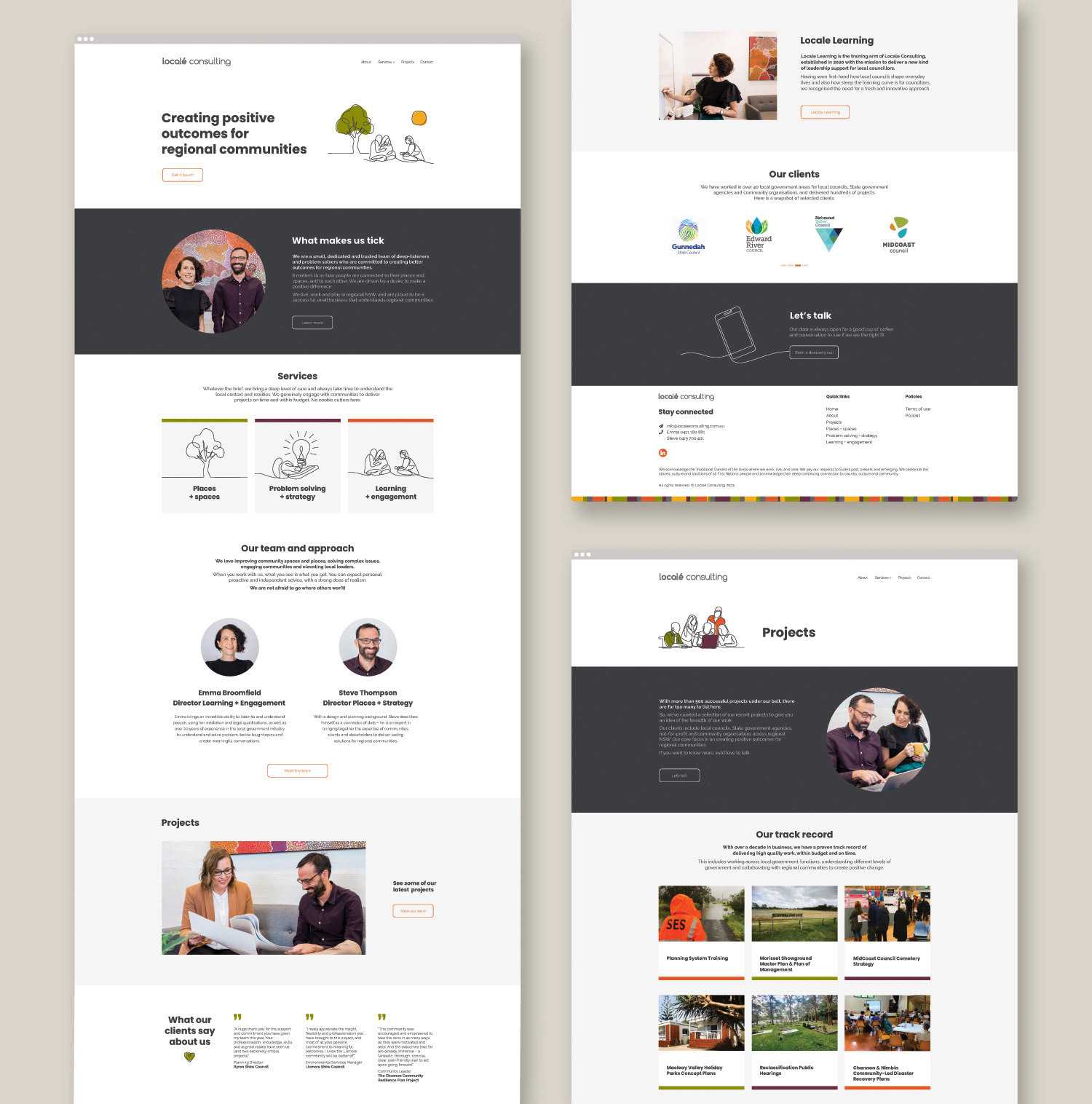
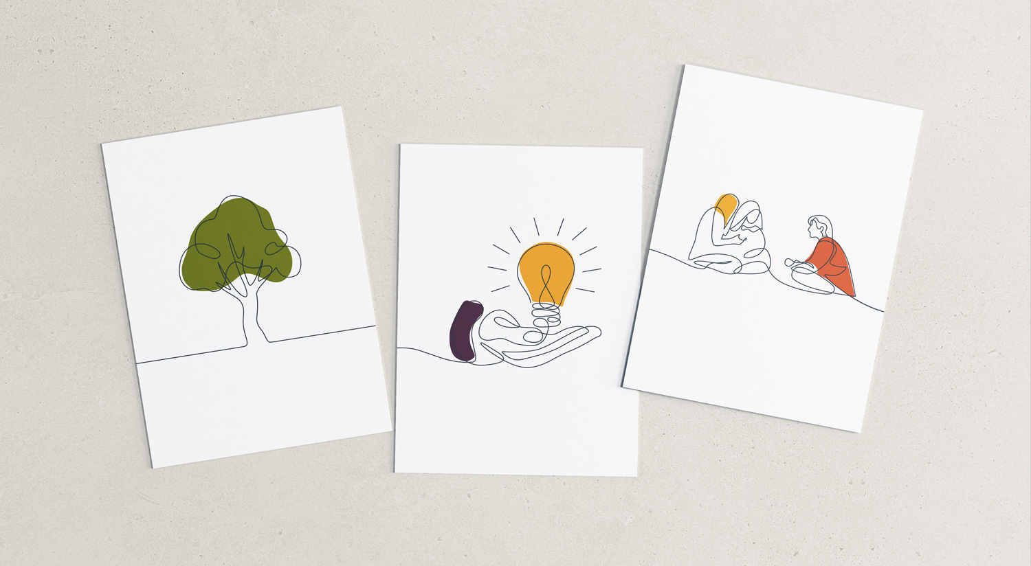
The customised graphics are sophisticated and similar in style to architectural drawings of purpose-built and thoughtfully designed spaces. The simplicity of the drawings drove the design for the website, which is minimalist and contemporary, but still obviously aesthetically related to the more vivacious and playful style of the website of the consultancy's training arm, Localé Learning.
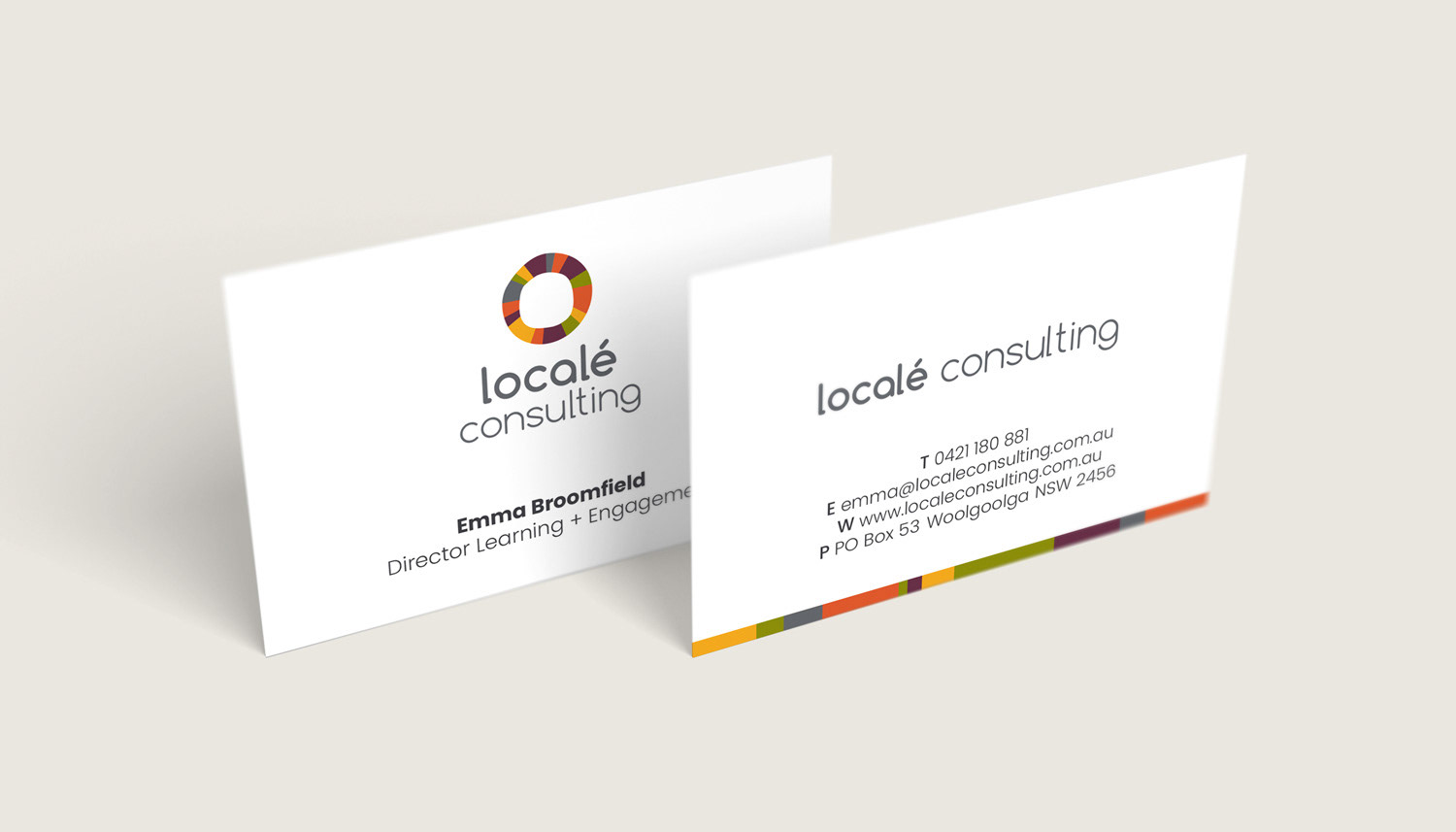
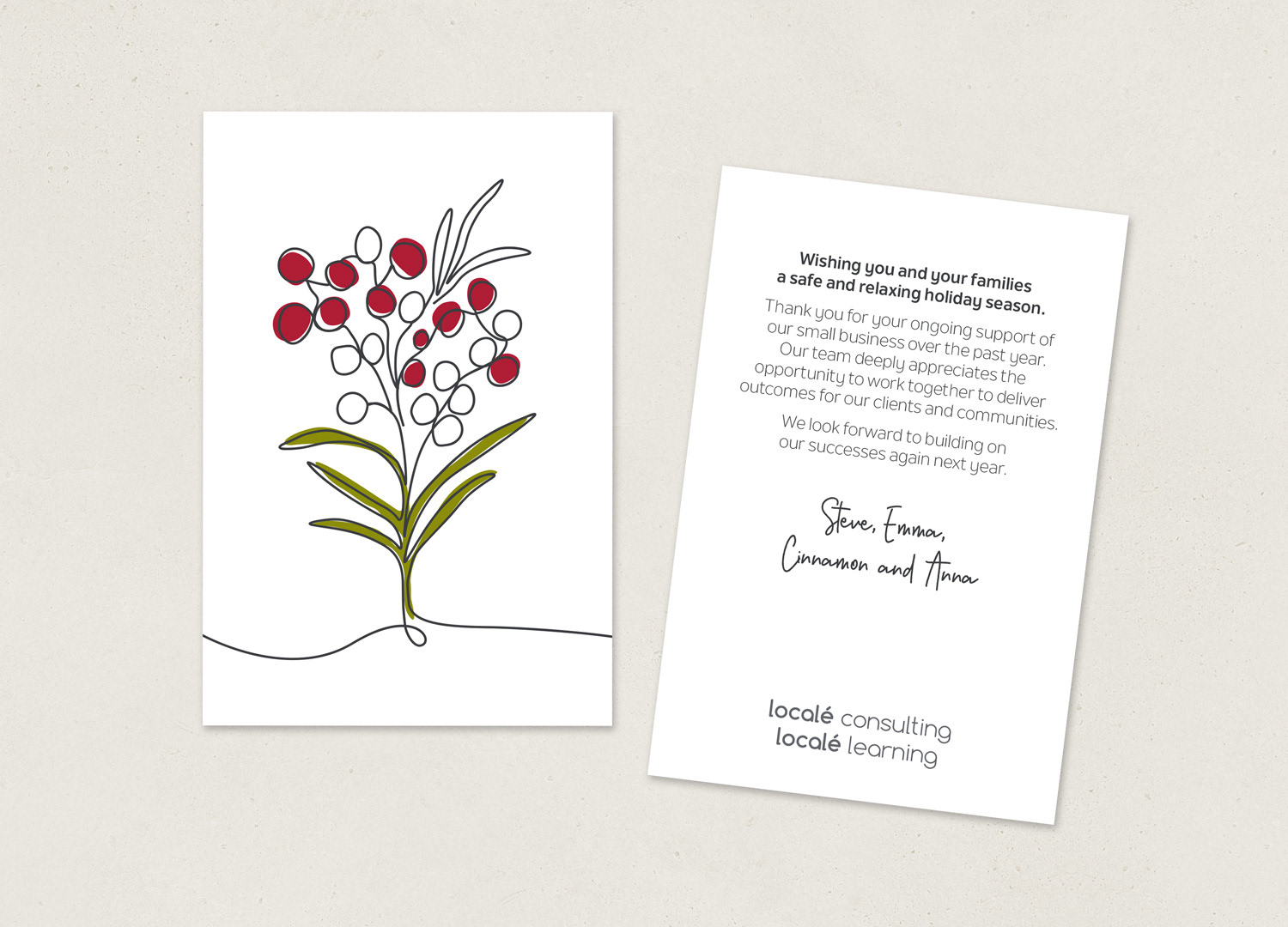
Logo redesign / Visual brand identity / Web design / Print collateral / Digital collateral / Customised graphics