

Aquamarine Australia
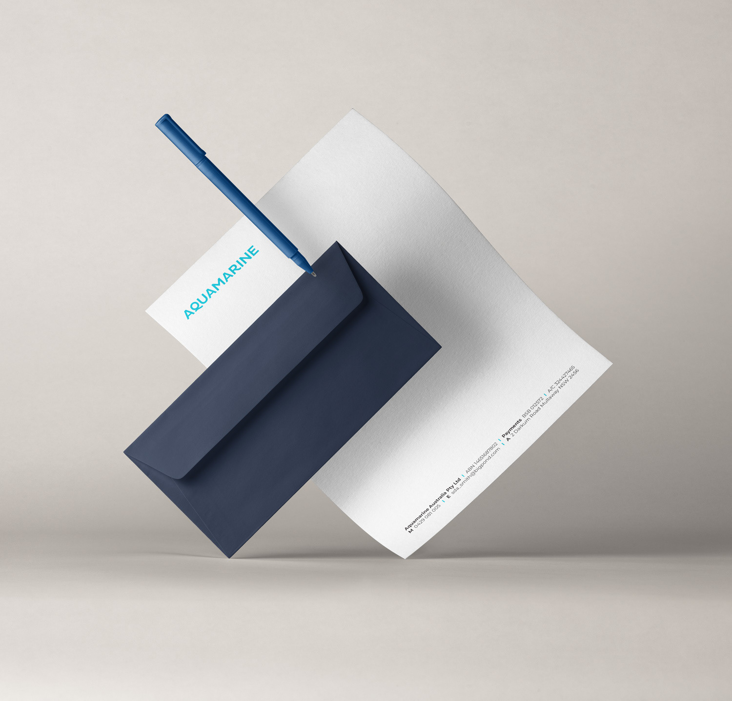
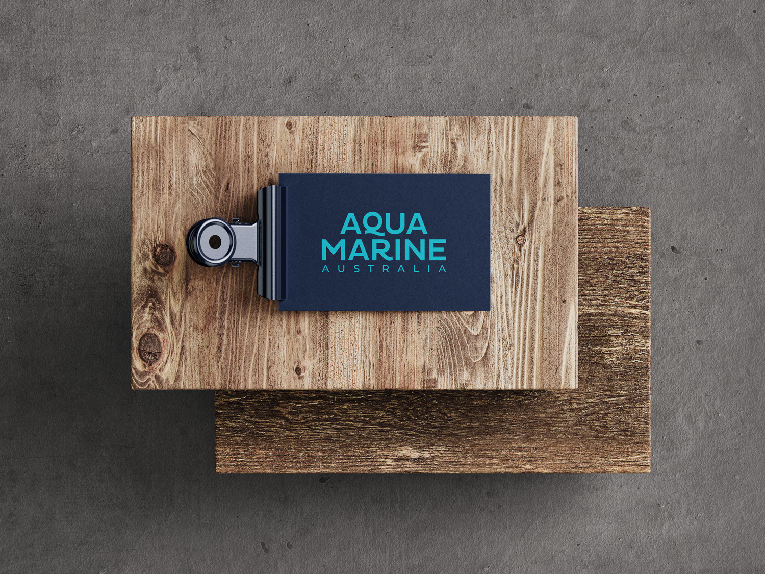
Brand identity for an environmental consultancy focusing on biodiversity assessment and human impacts.
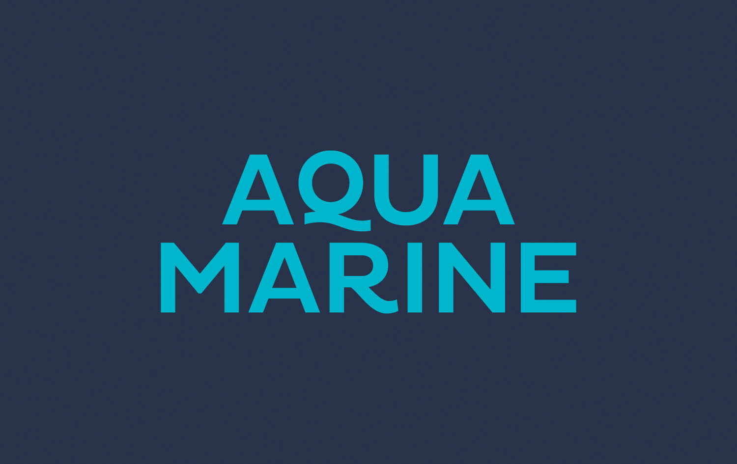
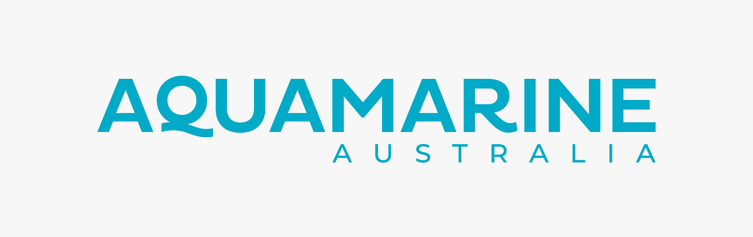
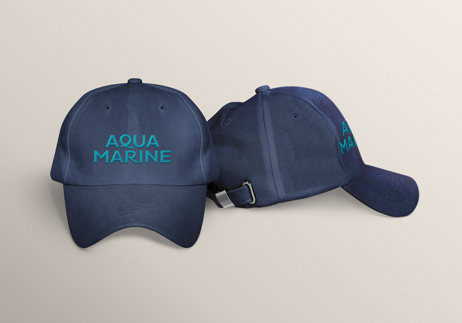
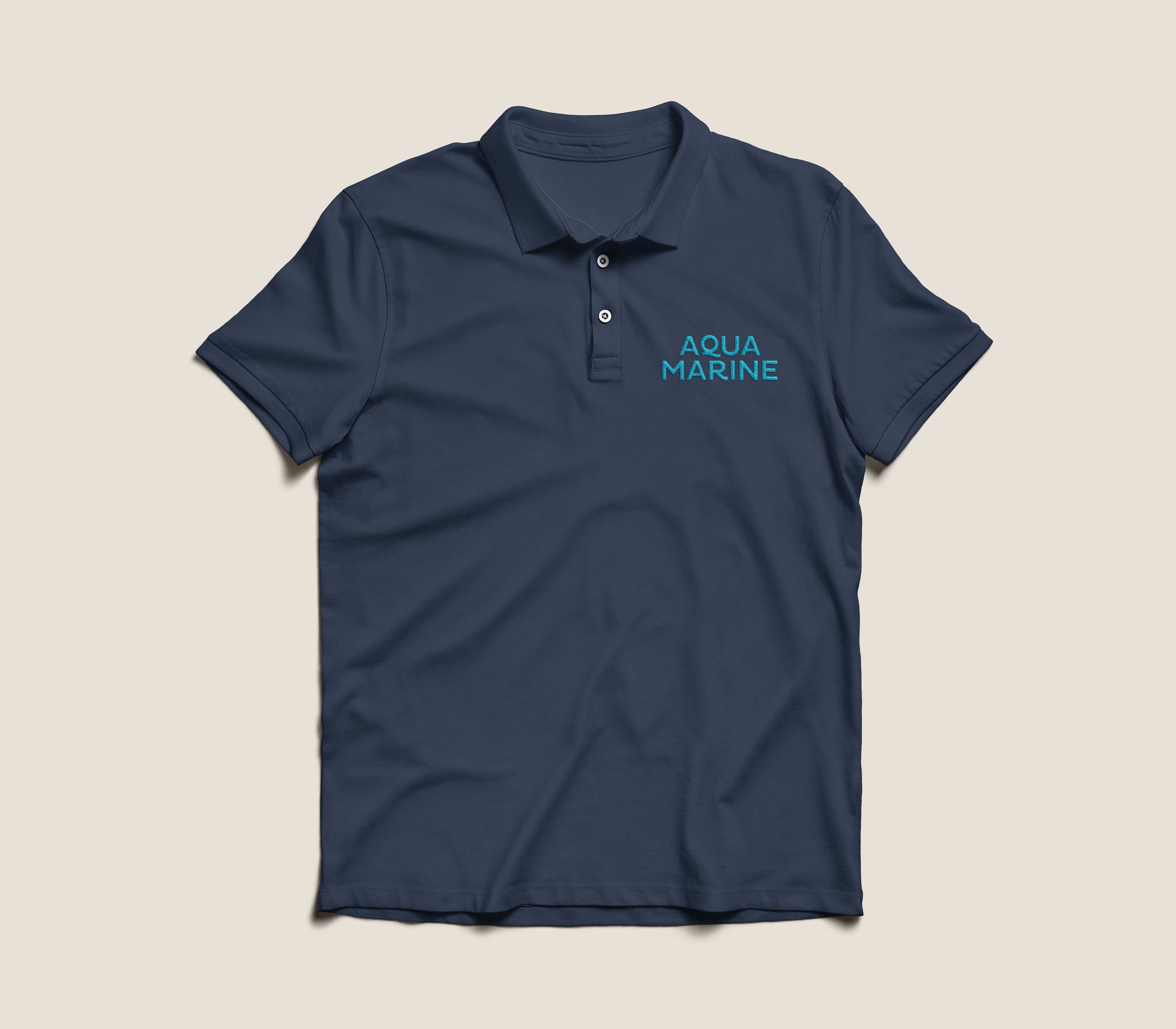
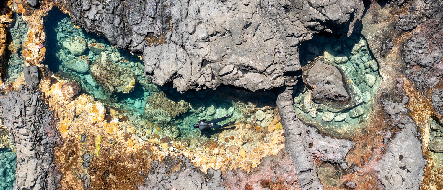
The brief for this project was straightforward: the client wanted a simple and professional but very obviously marine-flavoured brand identity. We chose a limited colour palette of blues, customising the logo type to create a wave-like tail on the 'Q' that echoes the tail in the original font's letter 'R'. In line with the Directors' vision for future expansion and a diversification of the company's activities, we opted to go with a text-only logo and to omit graphics from all of the branding. These design choices also allow the photographs, an integral part of the consultancy's operations, to really shine. (Photo @ Ian Hutton)
Logo design / Visual brand identity / Print collateral / Digital collateral / Apparel