
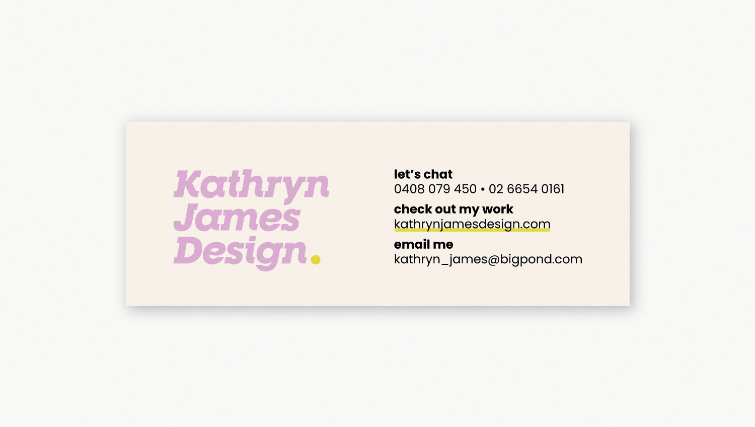

Kathryn James Design
I had such a good time rebranding my business that I had to include it in my portfolio.
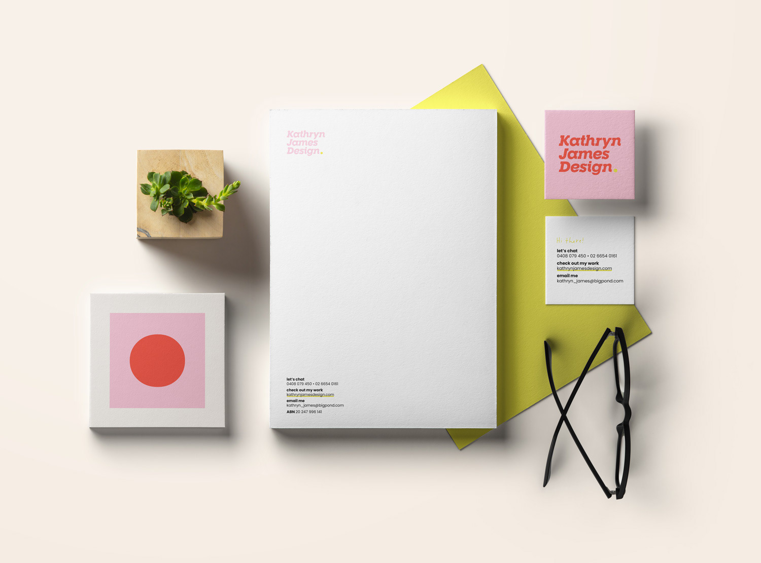
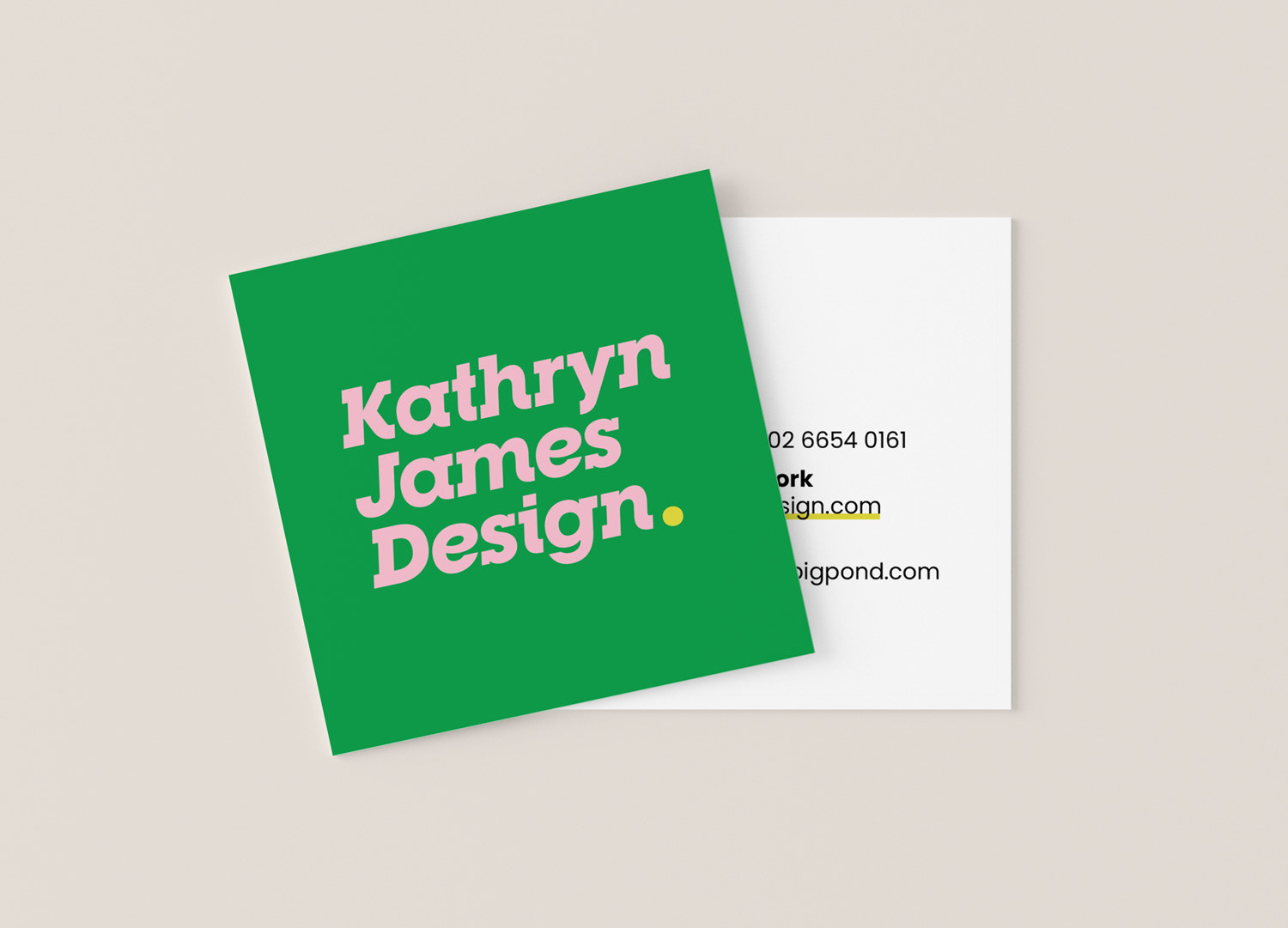
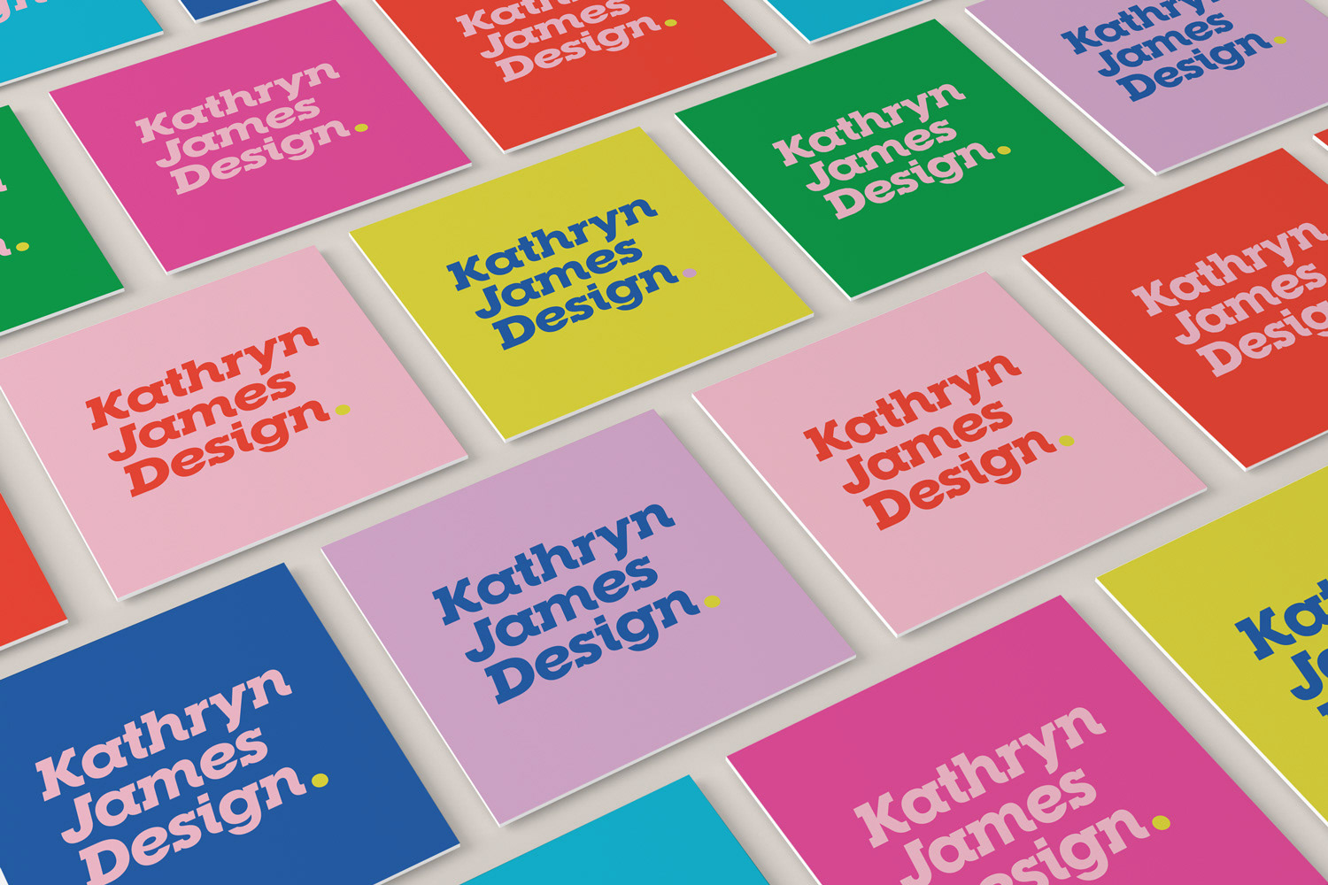
After an embarrassingly long time with a logo and brand identity that no longer suited me or my services, I went for a total overhaul. I wanted my new brand identity to reflect my love of bright, saturated colour, be a little bit fun, but also professional and clean. For my business cards, I used a printery which can print a different image on each card. That way, I could really go to town with the colour palette!
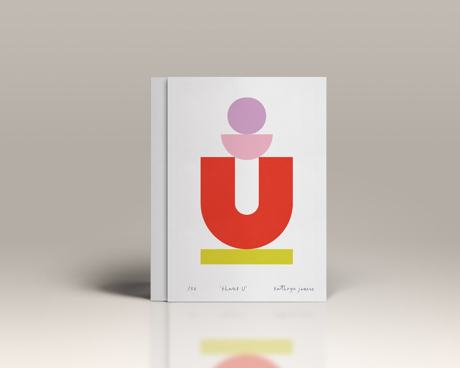
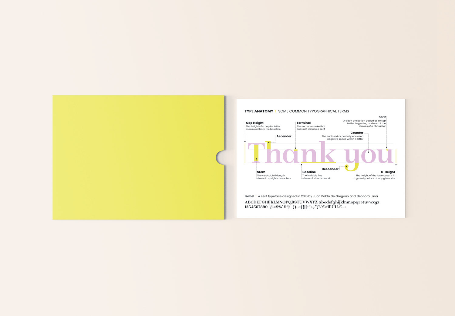
Each year I take great pleasure in sending out thank you messages to my clients for their custom, and I like to create an interesting, informative, and visually appealing piece to accompany them. In previous years, I’ve showcased information from the design world using infographics and Venn diagrams, covering topics such as typography terminology or the meanings associated with colours. In 2024, I opted for a limited edition of A5 prints in the new brand colours.
Logo redesign / Visual brand identity / Print collateral / Digital collateral / Digital illustration